Ken Lee, Senior Design Director at Nissan’s Global Design Centre in Atsugi, Japan has a long, distinguished career at Nissan. A 1999 graduate of ArtCentre College of Design in Pasadena, Calif., Lee joined Nissan Design America in 2003. During his first decade with the company, he received posts in Japan and Europe, returning to the U.S. as a Senior Creative Manager in 2014 and then was promoted to Design Director, Nissan two years later. In 2017, he moved with his wife and son and assumed his current title in 2019.
Among other ongoing projects, Lee led the design team for the all-new 2022 Pathfinder. The following interview was conducted at the Nissan Heritage Collection in Zama, Japan, next to an early generation Pathfinder, one of Lee’s favorite Nissan vehicles growing up.
You’ve said that the new design was inspired by the original, first-generation Pathfinder. Can you expand on that?
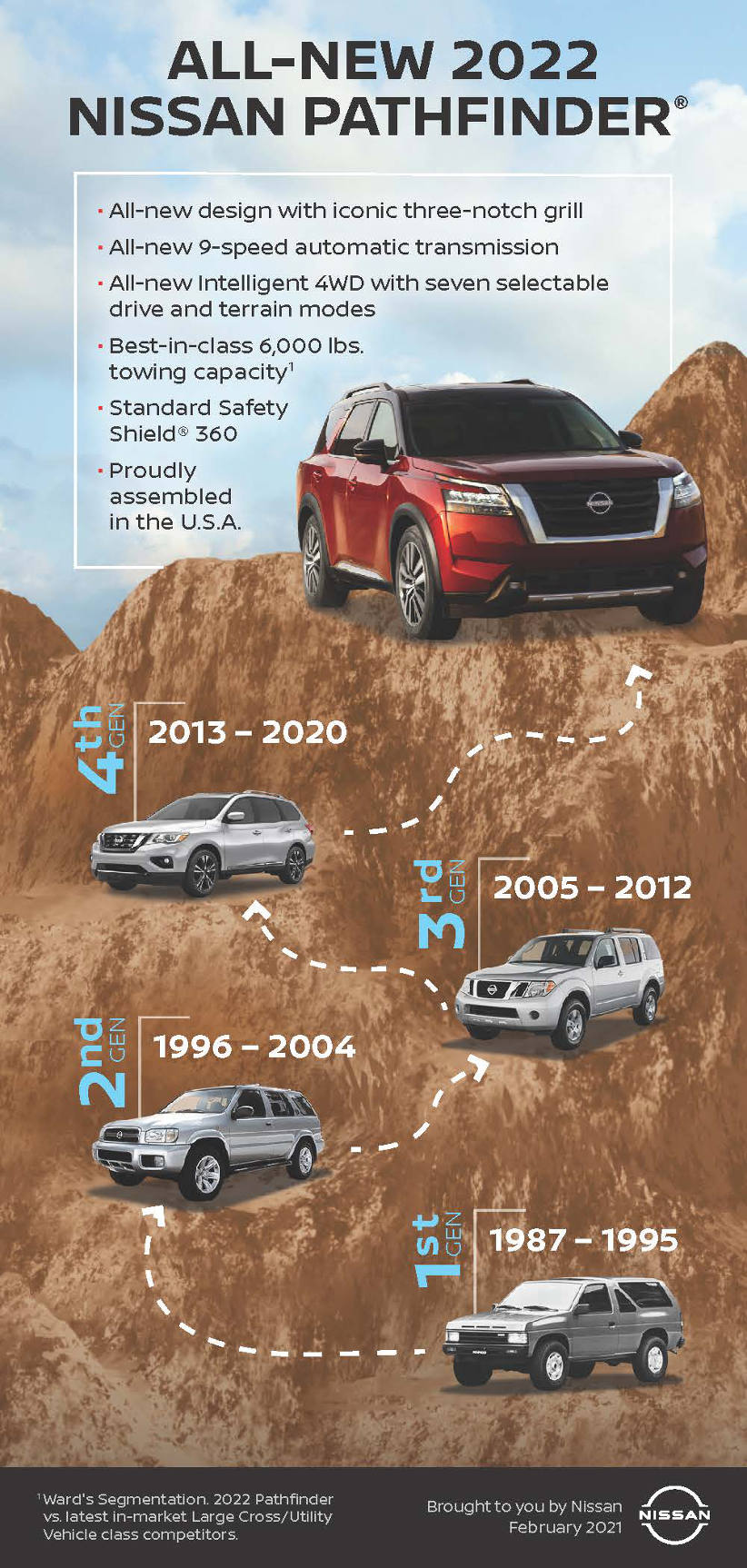
The original first-generation Pathfinder has been one of my childhood favourites. When I think back, seeing the first Pathfinder hit the road was very exciting because it brought something new, something fresh and exciting to the market.
On the road at the time, when you compared this with its contemporaries, those were much more traditional boxy looking SUVs, and then this Pathfinder comes along. It breaks new ground because it brings some of that fresh 1980s aero technology oriented aesthetics to the marketplace. For example, in the original’s front end, there is this large chamfer up top with the three very identifiable slots on the hood. These are instantly recognisable elements and it looked fresh, exciting and new.
Then looking at the body side, I always remember the fender blisters on the side that bulge out, showing the muscularity of the toughness underneath, but it was done in a fresh way. It’s not boxy, it’s integrated seamlessly with a very cool sculpture. So, there’s a twist to how the original Pathfinder treated all the elements and surfaces that made it new and fresh at the time.
Please explain how the design team updated and integrated the original Pathfinder’s iconic three-slot hood design into the all-new 2022 Pathfinder, and why is it important today that the slots are functional?
When we got the project brief for the new Pathfinder, of course we were quite excited because Pathfinder was such an icon for Nissan and we wanted to bring back some of the heritage and what made the original super cool, we wanted to bring it to the new one.
In the last decade or so, the family SUV segment has been going towards more and more comfort-oriented. The shapes are getting softer, more aerodynamic, and overall getting more car-like – which the customers like very much, and it’s very good for their lifestyle. However, as we move on to the next generation, we know there’s an opportunity to inject more toughness and more strength to this segment. So, we saw opportunity here and we found it in the inspiration of the original.
If you look at part by part, starting with a front end, of course, we have the famous three slots on the hood and we wanted this not to be literally incorporated into the new one, but as an Easter egg. It’s hidden at the top of the grille and it’s subtle, but those who remember the original will find it in the new one. And yes, it was important that they be functional for the purity of the design.
What are key big picture design elements?
Importantly, the whole shape and silhouette of the vehicle has been toughened up with the new Pathfinder. The front has become much more upright. The hood is straighter, much like the original one.
However, it’s not purely just the simple box. As the original does it, in the front it has a vertical wall facing the front, conveying strength and toughness. At the same time, the upper portion of the front is chamfered backwards with a sloping hood, so that’s quite an iconic element in the silhouette and we’ve tried to put that into the new Pathfinder, with the same type of silhouette that you can see that the new V-motion grille.
Our customers today have big expectations. They want comfort, they want every-day ease of use, and the ruggedness that allows them to go anywhere when they want to. So, with our new Pathfinder, we aim to combine all of these things together. Overall, the new design gives a sense of ruggedness and strength.
Explain how you adapted signature Nissan design language features like the floating roof, V-motion grille and C-shaped headlights to a big SUV like Pathfinder.
One of the elements that made the original Pathfinder look so clean and modern to me at the time was the sharpness and the details, the way they’re executed. It didn’t look like a traditional SUV then. And that inspires us for the new Pathfinder to also look for high-tech expression, the details, starting with the headlamps.
Lighting is a big thing these days, and we wanted to convey a sense of high-tech. And at Nissan, we’ve had the boomerang signature lamp for the past generation, and to bring it into an SUV, it’s interpreted differently. It’s more rectangular in shape, but at the same time, we’re finding some cleverness in the way we construct it. There are body color parts with the bumper fascia and the headlamp interlocking together to form a new movement that is rectangular, yet alludes to the Nissan boomerang signature.
Within the headlamps, also very detailed and intricate with full LED lighting, the signature itself forms a boomerang shape. So very iconic, very memorable, and sharp and crisp and clean.
What considerations or changes were needed to make the body work with a two-tone paint scheme?
Another very interesting element on the original Pathfinder, as everybody remembers, is the triangular quarter window. Now that was a three door, so of course on the new Pathfinder, which is a five door, we wanted to interpret it in a new way and we’ve come up with a new floating C-pillar that is quite structural. At the same time, the floating design allows us to provide a two-tone roof treatment, so it gives a sense of cleverness and something new and fresh on the new Pathfinder.
You’ve said that proportion is key to the all-new Pathfinder. Can you explain? Does that include areas like the high gravity silhouette and massive front end?
When we considered a new Pathfinder, the first thing we wanted to do is to enhance the proportions – making it bold, strong, and also have a simplicity at the same time. So, we strengthened the silhouette.
The front end becomes more upright. The hood is straighter and flatter. And the total silhouette is simple and bold, and also in the way we execute the treatment of the body surfaces and the design. In the original Pathfinder, the blister fender is very iconic, very special, at the time because it was showing a new type of design language.
On the new Pathfinder, we also aimed to capture the blister fender movement. So, there is a fender crease line over each wheel showing the muscularity and the strength of the stance, but at the same time, it is not a traditional blister fender. Looking along the body side, we see a very distinctive unique U-shaped highlight that catches each fender blister and fuses it together with the body side for a new sculpted, fresh feeling.
What is unique about the new rear design? Can you explain the decision to use a larger than previous Pathfinder branding on the liftgate?
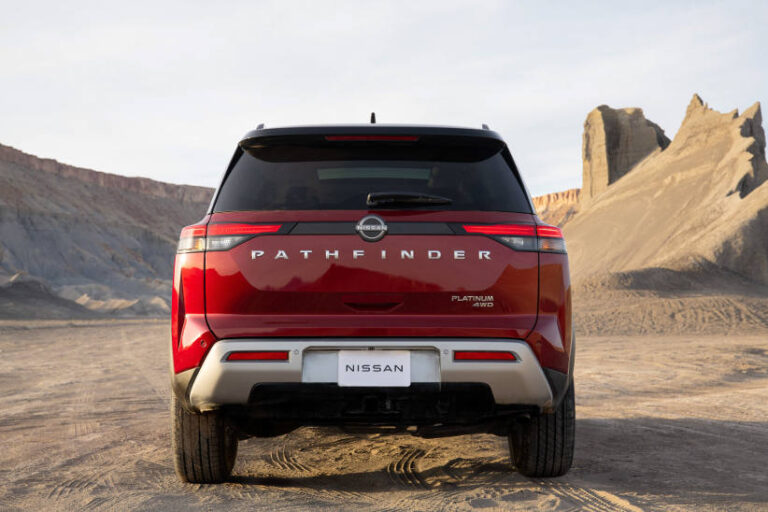
For the rear of the new Pathfinder, our goal was to make it clean, simple and wide feeling, much like the original. The new tail lamps are flush, horizontally oriented, giving a sense of width, and overall has a very modern appeal. And you’ll notice that in the centre, we proudly display the Pathfinder badge with big letters to signal that the Pathfinder is back.
The interior of the all-new Pathfinder is very refined, yet the exterior is very rugged. How did you reconcile the two, so they work as an integrated unit?
A8: While our new exterior is tough and strong, when we move into the interior, we continue that theme of strength and capability, but at the same time we give it lots of comfort, which is what our customers expect.
When you look at the shapes of the instrument panel and the door panels, we’ve designed them to be bold with very strong sections across all the surfaces, so you feel safe inside and you feel that this is a dependable vehicle.
On the instrument panel, the air vents have a unique shape that interlocks onto the soft surfaces of the instrument panel. They look unique, iconic and memorable. The centre console is wide and purposeful.
At the same time, we give it that sense of quality. All the surfaces are wrapped in premium materials with visible stitching, and overall the sense of quality has gone up.
Q9: The interior colouring is very attractive and somewhat unique. What role does color play, inside and out, in making Pathfinder stand out from the competition?
What I remember from my childhood, those Pathfinder advertisements in magazines, they were in the bright red color, very iconic and memorable. They just popped with energy. And in the new Pathfinder, again, we have a very interesting red color called Scarlet Ember, and this color gives the vehicle lots of energy and it shows off the forms very well.
And this time around, to add something new, we are introducing a two-tone color on the Pathfinder, so you could get it with a black roof, and we’ve carefully designed the graphics on the body side, including the floating C-pillar, to allow the two-tone roof to seamlessly integrate into the overall design.
Another exterior color that we’re introducing on the new Pathfinder is Obsidian Green. Now this is a very interesting new color because it has a solid-like quality yet with a hint of pearl, so it conveys a sense of toughness and outdoors image. Ready to go on an adventure.
The interior coloring is new and the materials are fashionable but durable. The new accents take metal coloring to a warm space. Some of the interior environments were inspired by athlete foot ware, others by high-tech outdoor adventure gear.
The all-new Pathfinder has many advanced technology features, such as an all-new 10.8-inch Head-Up display, wireless charging and ProPILOT Assist. How did you incorporate the sense of technology into the new Pathfinder’s exterior and interior?
The centre display screen is placed high on the instrument panel for easy visibility while all of the controls are logically grouped together, so overall you look at this interior and there’s a sense of function and it’s very user-friendly for our customer.
As we move down to our centre console, you’ll see that the wireless charger is integrated along with our drive-by-wire shifter. So, all of this technology is neatly integrated into this spacious and inviting interior.


